The Lay’s logo is instantly recognizable worldwide, yet its appeal goes far beyond simple familiarity. At first glance, it communicates warmth, friendliness, and comfort—qualities that echo the experience of enjoying the snack itself. The design deliberately avoids sharp edges or aggressive lines, instead opting for soft curves, balanced forms, and bright, inviting colors that evoke emotional ease. Lay’s positions itself not as a luxury item but as a source of everyday pleasure, integrated seamlessly into daily routines: sharing laughter with friends, relaxing during a favorite show, or enjoying a simple snack break. The logo serves as a visual shortcut to these experiences, creating a sense of trust and nostalgia. Even as packaging and marketing campaigns have evolved over decades, the core design has remained consistent, reinforcing a reliable emotional connection with consumers.
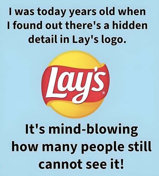
Central to the logo’s identity is its bright yellow circle. Yellow universally signifies warmth, optimism, and energy, making it a perfect choice for a food brand seeking to convey joy and stimulate appetite. The circle’s shape reinforces these associations, appearing friendly, inclusive, and complete. Unlike angular forms, circles lack tension, making them psychologically comforting. In Lay’s design, the circle also carries dual symbolism: it evokes both the sun and the potato chip itself. This layering of meaning suggests freshness, natural ingredients, and warmth while visually linking directly to the product. A subtle glow applied to the yellow center enhances vitality, making the logo feel active, inviting, and alive—rather than flat or static.
The sun-like imagery contributes to Lay’s emotional message of understated happiness. Rather than dominating the viewer, the glow radiates a sense of calm joy, implying that the brand’s role is to enhance everyday moments. The warmth suggested by the yellow circle positions Lay’s as emotionally accessible: it does not aspire to exclusivity but instead promises uncomplicated delight. This accessibility ensures the brand resonates across cultures, age groups, and lifestyles, conveying happiness in a quiet, enduring way. Brightness here is not showy—it is comforting, reliable, and familiar, reinforcing the brand’s identity as a consistent source of lighthearted pleasure.
Encircling the yellow is the red ribbon, adding contrast, energy, and visual flow. Red is a powerful color in food marketing because it captures attention and stimulates appetite, yet the logo softens its intensity through smooth, flowing curves. The ribbon’s gentle motion conveys dynamism without aggression, providing visual interest while maintaining approachability. It also serves as a structural anchor for the wordmark, guiding the eye naturally toward the brand name while creating a subtle sense of depth. This careful balance of vibrancy and softness ensures the logo communicates excitement and taste cues without overwhelming the viewer, sustaining its emotional harmony.
The interplay between the yellow and red elements amplifies the logo’s visibility and memorability. High contrast makes the design stand out across multiple formats—from supermarket shelves to digital screens—while maintaining a warm, friendly feel. The colors have become a visual shorthand for Lay’s itself; even a quick glance is enough to evoke flavor, fun, and comfort. Over time, these visual cues have become inseparable from the brand’s identity, functioning as a universal language of happiness, ease, and familiarity. Their enduring presence reinforces recognition, ensuring that consumers immediately associate the logo with the positive experiences and emotional connection Lay’s fosters.
Typography completes the design’s personality. The Lay’s wordmark features rounded, slightly tilted letters that feel casual, playful, and approachable. The curvature echoes the circular motif of the logo, reinforcing visual cohesion, while the tilt conveys motion, energy, and joy. White lettering enhances readability and symbolizes simplicity and honesty, blending seamlessly with the colorful background rather than competing with it. Together, the typography and imagery form a cohesive identity that communicates friendliness and accessibility. It aligns perfectly with Lay’s positioning as a brand that delivers uncomplicated pleasure, emotional comfort, and everyday joy.
In sum, the Lay’s logo demonstrates how thoughtful design can communicate more than a product name. Through its careful use of color, shape, and typography, it evokes happiness, warmth, and familiarity, resonating emotionally across cultures and generations. The design reinforces the brand’s promise: simple, lighthearted enjoyment woven seamlessly into daily life. Its success lies not in trend-chasing but in the timeless clarity of its message, ensuring that Lay’s continues to be recognized, trusted, and embraced worldwide.