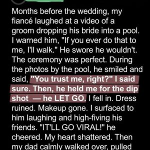
At first glance, the Lay’s logo seems simple, cheerful, and instantly recognizable—the kind of design so familiar that most people barely register it consciously. Yet a closer look reveals subtle, purposeful design choices that have been honed over decades. The red ribbon sweeping across the center is not merely decorative; its gentle, flowing curve mirrors the banner used in earlier Frito-Lay branding, maintaining a sense of rhythm and continuity that resonates on a subconscious level. Even those who have never studied the brand’s history recognize the shape as familiar, because the human brain instinctively responds to repetition, pattern, and positive associations. This subtle ribbon suggests motion, warmth, and generosity, guiding the viewer’s eye naturally across the logo. It communicates trust, familiarity, and approachability long before a single word is read, shaping consumer perception without any conscious effort. In a marketplace crowded with flashy or aggressive designs, the Lay’s ribbon stands out not through novelty, but through recognition, quietly reinforcing a sense of comfort and dependability.
Behind the red ribbon lies the bright yellow circle, an element that seems almost obvious yet carries layers of meaning upon closer examination. On a surface level, it evokes the image of a potato chip glowing with warmth, freshness, and indulgence. Yet psychologically, yellow is linked to optimism, appetite, and energy, making it an ideal choice for food branding. The circular shape itself, rounded and approachable, contrasts sharply with the angular, corporate-heavy logos common in many industries, which can feel distant or intimidating. Rounded forms communicate friendliness and accessibility, and the Lay’s logo preserves this principle with deliberate care. Over decades, the circle has remained a visual anchor, framing the brand name as if it were in a spotlight while reinforcing emotional cues tied to enjoyment, sharing, and comfort. Even as packaging technologies, print methods, and retail displays have evolved, this circle has maintained its role as a reassuring constant, subtly guiding consumer perceptions and maintaining trust.
These design choices are far from arbitrary; they are strategic expressions of brand stewardship. Unlike many modern consumer products that overtly reference corporate heritage or rely heavily on slogans, Lay’s embeds its legacy into the visual structure itself. The logo carries decades of trust without feeling old-fashioned or burdened by history. Longtime consumers may not consciously recognize these connections, but they feel them intuitively. Newer generations perceive the logo as clean, polished, and contemporary, unaware that their impressions are informed by design elements rooted in decades of brand evolution. This balance between honoring the past and embracing the present exemplifies strategic brand management. Lay’s achieves continuity without rigidity, allowing its visual identity to adapt to modern retail environments and evolving consumer expectations while maintaining a sense of reliability and familiarity that has always defined the brand.
The story of this visual continuity stretches back to 1932, when Herman Lay began selling potato chips from a modest operation, relying on simple packaging and personal relationships to build trust. Branding in that era was not about global consistency but local recognition, emotional connection, and consumer loyalty. As the business grew, merged with Frito Company, and eventually became Frito-Lay, the need for cohesive, recognizable branding intensified. From the beginning, the focus was on friendliness, approachability, and emotional resonance. Snack foods are deeply tied to human experiences—childhood memories, family gatherings, road trips, and comfort moments. Design elements like flowing ribbons, warm colors, and rounded shapes were intentionally chosen to evoke these emotions, fostering a connection that went beyond taste. The modern Lay’s logo continues this philosophy, using contemporary design techniques while preserving the same subtle psychological cues, ensuring that the emotional connection between product and consumer remains unbroken across generations.
Over the decades, the Lay’s logo has undergone refinements—typefaces optimized for readability, colors adjusted for modern printing, and proportions tweaked to ensure visibility in crowded retail shelves. Yet despite these changes, its core structure has remained remarkably stable. The red ribbon continues to cut confidently across the center, suggesting motion and vitality, while the yellow circle anchors the logo, projecting warmth and focus. This stability is a strategic advantage in a world where visual trends change rapidly and brands often feel compelled to reinvent themselves constantly. The brain responds to patterns and familiarity, and this subconscious recognition builds trust, subtly guiding purchase decisions even when consumers believe they are choosing rationally. In essence, consistency has become a silent but powerful tool, allowing Lay’s to stand out not by flashy redesigns, but by providing reassurance in a sea of ever-changing visual stimuli.
What makes the Lay’s design approach especially remarkable is its restraint. It never overtly announces its history, nor does it rely on slogans, timelines, or nostalgia to communicate longevity. Instead, the logo quietly carries its legacy forward, blending the past with the present and reassuring consumers with each glance. In a category dominated by limited editions, bold experiments, and constant marketing noise, this understated approach builds loyalty and reinforces trust. Consumers sense stability without even realizing it, a psychological advantage that strengthens the brand’s position over time. Ultimately, the Lay’s logo is more than a visual identifier; it is a study in brand memory, emotional design, and behavioral influence. The red ribbon and golden circle connect a small 1930s potato chip operation to a global snack empire, silently teaching that the most enduring brand power often lies not in the loudest message, but in the quietest details carefully preserved across generations.